|
|
Chris De Herrera's Windows CE Website |
|---|---|
About |
|
| By Chris De Herrera Copyright 1998-2007 All Rights Reserved A member of the Talksites Family of Websites Windows and
Windows CE are trademarks of
Microsoft All Trademarks are owned |
User Interface
Consistency
By Chris De Herrera,
Copyright 2001
Revised 11/18/2001
[an error occurred while processing this directive]
User Interface Consistency
While snapping over 150 screen shots of the Pocket PC 2002, I noticed that
the user interface is still not consistent.
Examples
Scroll bar is not required but displayed

How can you rest your palm on the screen?
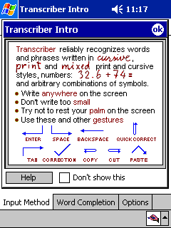
Ok Button in dialog box instead of
titlebar
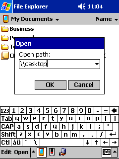
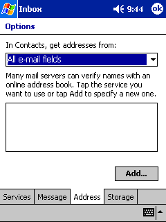
Add Button instead of Add Item in list

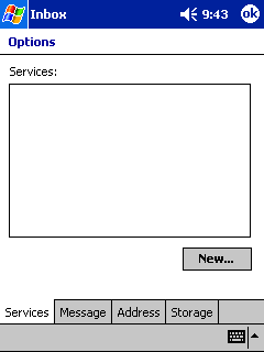
New button instead of new item in list
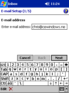
Inbox introduces a new metaphor for Help
Conclusion
If Microsoft wants developers and users to adjust to the User Interface, then it should be consistent. It's disappointing to see multiple applications with these inconsistencies.
[an error occurred while processing this directive]


